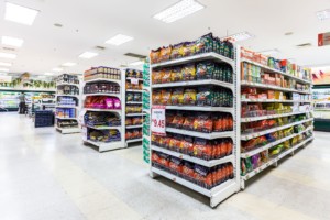
 A well-worn adage of real estate about what matters most when selling a property is “location, location, location.”
One might say the same about real estate in a store. The places your customer looks most – the display areas they are most likely to encounter – are the equivalent of waterfront property.
So what’s the charming abode overlooking the lake in your convenience store? The end cap.
The shelf section at the end of an aisle – or at the end of a gondola, as the regular aisle shelves are called – is an end cap. Their visibility makes them a highly desirable place to put a featured product.
Because of their high visilibity, they are the best place to display the items you most want to sell, including the items with the highest margin — items that can make you the most money.
Have any doubt about the effectiveness of end caps? In some grocery stores, manufacturers may pay for the privilege of being featured there in order to push their products.
A 2014 study by Point of Purchase Advertising International found that 82 percent of buying decisions are made in stores. (http://www.prweb.com/releases/2014/02/prweb11572195.htm)
According to research by OgilvyAction, almost 20 percent of shoppers make impulse buys in categories in which they didn’t set out to shop, and a quarter of those buyers noticed the products in a display.
An end cap display is a great way to capture the attention of those shoppers.
There are different approaches to stocking an end cap. A hodgepodge of items is confusing to the eye and will exert less of a draw on your customers. Ideally, one item or a group of related items is placed on an end cap. Similar items have a strong impact when displayed together – for instance, one brand of soda that’s on sale, or seasonal items that mark the start of spring. And some groupings – like those seasonal items – offer an opportunity for especially creative, attractive displays.
Things to keep in mind when assembling your end cap display:
– Make sure customers can access the merchandise. Keep in mind that not everyone is seven feet tall. If your cases of soda are stacked to the ceiling, how will they be extracted for purchase?
— Don’t leave ugly gaps in an end cap. One, sparsely stocked shelves look haphazard and messy. Two, you’re wasting prime retail real estate. In fact, stocking end caps more deeply means giving an impression of plenty, and you won’t have to restock those shelves as often.
–Group items of similar size or kind in vertical or horizontal “stripes” in your display.
–Pre-made display shelves (for instance, labeled with the attractive graphics of a particular brand) can be a visually impactful and effective way to draw a customer’s eye.
— Make sure your signage is clear, especially if you are advertising a particular price point or sale. If customers don’t easily see the price, they won’t pick up the product.
–Keep safety in mind when building your display. Beware teetering products, rickety infrastructure or anything that sticks out and poses a hazard.
— Have good lighting on your end cap to make the display bright and easily visible.
— Make the end cap special. It shouldn’t look like every other shelf in the store.


